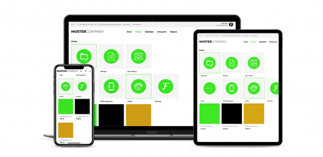
Responsive Design – WUNDERHUB to go
For the first time in 2015, Google reported more search queries via mobile devices than via desktop browsers. Since then, the relevance of adapting website content for mobile phones and other compact devices such as tablets has become much more important. Programming and presentation in the so-called Responsive Design, meaning the clear and simple function on every screen format, is expected by users today for almost every digital application. Of course, this also applies to WUNDERHUB, and rightly so. With the Portal 2.0 Mobile, this expectation is now fulfilled.
Responsive Design – WUNDERHUB to go
Mobile First is the motto
In the mobile-first strategy, the core aspects of the software are defined first. This is not only about content and images, but above all about the most important functions and modules that need to be integrated as elements. The basic idea of this strategy is to concentrate only on the essentials instead of investing more programming effort than necessary. The big advantage with Mobile First: A supposed weakness becomes an advantage. Small screen; ergo smaller display area and format restrictions. But instead of losing substance, irrelevant information and functions are put aside. The result: a reduced and yet user-friendly solution.
Living - and driving - digital transformation in the company
The spread of digitalisation is developing at lightning speed and yet it is only just getting started. Media use, new technologies, tools that make work and private life easier - all developments are paying for connectivity that is becoming more and more self-evident and from which everyone benefits. Any company that is aware of this importance today will gain advantages and a head start through digital transformation.
Connecting employees and partners, involving them, integrating them without being tied to a specific location: all this is agile, flexible, future-oriented and innovative. Creating new interfaces, offering new work structures, increasing the output AND quality of life of those involved - mobile access to all relevant information and functions contributes to increasing personal satisfaction and joint success. The bottom line is a strong result.
Portal 2.0 is just the beginning

With the portal version 2.0 Mobile, WUNDERHUB makes all advantages available on mobile devices. All templates, standards, applications, functions and networking are available in full. And with each automatic release in the future, freedom and convenience grow a little more. And all those who use it. This inspires and drives every day anew. In the truest sense, development out of passion. Really exciting. Release 12 in 2021 makes WUNDERHUB mobile.


